The FontFront competition pits two redesigned versions of every letter in the English alphabet against each other, turning typography into a head-to-head face-off. This year drew nearly 1,200 entries, and the top two designs for each letter will appear offline at Kastner Community (Kastner Kommunity) starting November 6. The goal: spotlight the creative punch of graphic design and show how far letterforms can be pushed without losing their voice.
When and where
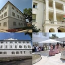
Runs Thursday, November 6, 2025, through Wednesday, December 10, 2025, at Kastner Community (Kastner Kommunity). The exhibition is open through December 10, giving visitors a month to compare styles, vote with their eyes, and geek out over ligatures and curves.
What to expect
Fifty-two finalists, one tidy alphabet, countless ways to rethink structure, rhythm, and personality. From razor-sharp serifs to elastic sans, the lineup celebrates meticulous craft and playful experimentation. It’s a crisp snapshot of how designers remix tradition and push typography forward—letter by letter.
Cover image: FontFront